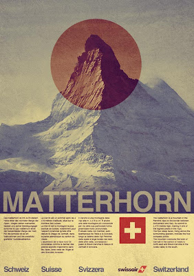
Follow this step by step Photoshop tutorial to create a modern, clean, travel poster design for Swissair, and then learn how to transform into vintage poster design. We will use useful techniques related to patterns, visual organization with Photoshop guides, grunge texture to give a distressed look to the composition and adjustment layers for final retro touch.
Learn how a range of Photoshop techniques pull together the various elements to create the final design.
Preview
Click on the preview image to see the final result in full size.
Step 1: Create Photoshop Document
Fire up Photoshop and create a document with your desired poster dimensions (File -> New) and choose white for the background color. If you are planning to send your work to the printing press, use a high DPI (between 150-300dpi) and CMYK Color Mode.
For this tutorial, I created a document sized at 800x1135px, RGB Color at 72dpi (for web use).
Add 2 Vertical Guides (View -> New Guide) at 15px and 785px.
Step 2: Add Mountain
Download Matterhorn 1 photo from stock.xchng and import it onto design (use image below as refference).
Select photo and press Cmd/Ctrl + U to open the Hue/Saturation window. Check "colorize" and enter the following settings:
Add one more guide (View -> New Guide), but this time Horizontal at 878px. With Rectangular Marquee Tool (M) make selection,
then go to Layer -> Layer Mask -> Reveal Selection to apply layer mask.
Step 3: Add Text
Pick up Horizontal Type Tool (T), for the font choose Helvetica, and type "MATTERHORN".
Lower the Opacity of text layer to 60%.
As you can see it's a bit hard to read the text, so we're going to fix that.
Create new layer (Cmd/Ctrl + Shift + N) below text layer,
Cmd/Ctrl + click on image layer mask to make selection (this way operation will only be applied to selection not the whole canvas),
set the Foreground color to #204660, choose the Gradient Tool (G) and select the Foreground to Transparent preset in the Gradient Editor,
and draw a few gradients to create subtle background below the text, so the text can become more visible and easy to read.
Step 4: Add More Text
In this step we are going to add more text to poster design. Before we start adding text, we need to make order using Photoshop guides.
If you take a look at final design you can see that there are 5 columns: 4 columns with text and 1 column with Swiss flag. So it's time to do some math.
We added 2 Vertical guides at the beginning (15px and 785px) so the availabe space for columns is 770px. The width of each column (including gap between columns) is 154px (770px/5=154px).
I set gap between columns to 10px, this means that each column is 144px wide.
Go to View -> New Guide and set the Vertical guides at:
- 159 (end first column)
- 169 (beginning second column)
- 313 (end second column)
- 323 (beginning third column)
- 467 (end third column)
- 477 (beginning fourth column)
- 621 (end fourth column)
- 631 (beginning fifth column)
Add one more guide, Horizontal, at 893px. With this we set the distance between image and text to 15px.
We can start adding text. With Horizontal Type Tool (T) create text box,
300% zoom
and type text. I started with German description of Matterhorn from wikipedia.
300% zoom
Add short descriptions in French, Italian and English language using the method above.
Step 5: Create Swiss Flag
With Rectangle Tool (U) create red (#d52b1e) rectangle, sized at 108x108px, in empty column.
300% zoom
Next, with Line Tool (U), create 20px weight, vertical white (#ffffff) line.
300% zoom
Duplicate this layer (Cmd/Ctrl + J), go to Edit -> Transform -> Rotate 90 CW.
300% zoom
Step 6: Add Even More Text
Go to View -> New Guide and add one more Horizontal Guide at 1120px.
Grab Horizontal Type Tool (T), for font choose Helvetica Bold, set font size to 30px, color to #3d6989 and type Schweiz.
Using the same method type name of Swiss country in 3 more languages (French, Italian and English).
Step 7: Swissair Logo
Jump over to wikipedia (nifty resource for us designers), download 200px Swissair logo, and insert into our design.
Convert the logo layer to a Smart Object so we can perform nondestructive transforms on it. With Free Transform Tool (Cmd/Ctrl + T), scale it down a bit (make it smaller) and place it like on the picture below.
Set the logo Opacity to 75%.
And this is what we have done so far:
Step 8: Red Circle
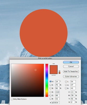
Invoke Ellipse Tool (U), hold Cmd/Ctrl + Shift and draw red (#d25934) circle.
Change the Blend Mode to Color Burn and lower the Opacity to 70%.
Step 9: Create And Add Diagonal Lines
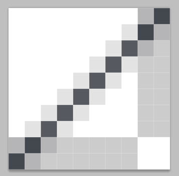
Create new document using 10 pixels for the width and 10 pixels for the height, with transparent background. Set the Foreground color to #02152a and with Line Tool (U) draw diagonal line.
3200% zoom
Go to Edit -> Define Pattern. Name the new pattern the way you want it, and you will have a very cool diagonal pattern.
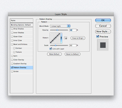
Back to our design, add a layer on top and fill with white. Open the Layer Style dialog window by double-clicking on the layer. Add Pattern Overlay effect, using the pattern we created.
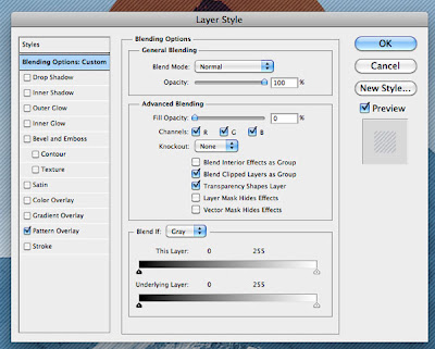
Select "Blending Options" in Layer Style window and reduce Fill Opacity to 0%. By doing this we removed white color (fill) but pattern overlay remain visible.
With Rectangular Marquee Tool create selection around image and then go to Layer -> Layer Mask -> Reveal Selection to apply layer mask.
At this point we can stop!
We have created cool, clean, modern poster design. Click on the image to see it in full size.
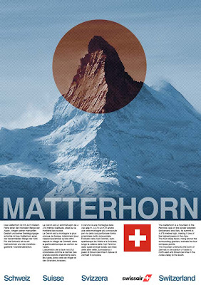
In next 2 steps I will show you how to transfrom this modern, clean poster design into retro/vintage looking poster.
Step 10: Add Texture To Composition
Import awesome Grunge texture by darkrose42-stock into our design and place it just below red circle layer.
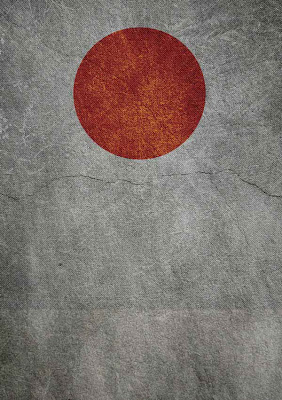
Change the Blend Mode to Hard Light and set Opacity to 30%.
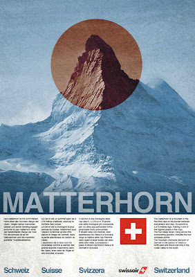
Step 11: Final Vintage Touch Using Gradient Map
This is the last step in the tutorial. We will use an adjustment layer to give our entire composition the color theme we are going for.
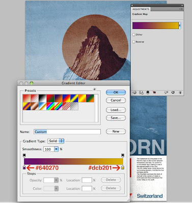
First, let us go to Layer -> New Adjustment Layer -> Gradient Map to add an adjustment layer above all the other layers.
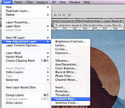
The Gradient Map adjustment layer alters the image by applying a gradient map to the image. Gradient map applies the gradient by using the lightness and darkness values in the image as a map for how the gradient colors are applied.
Set a gradient going from dark purple (#640270) to dark yellow (#dcb201), then lower Opacity of adjustment layer to 40% to give our design a faded vintage feel.
No comments:
Post a Comment